
Creative colour schemes
Seeking some personality for your property? Let’s breathe fresh life into our towers and estates
If you’re tired of seeing a rainbow of grey in our suburbs and estates, you’re not alone.
And if you’re on the committee of a colourful property contemplating a repaint, you may be wondering whether to stay colourful, or venture into the 50 shades.
Older strata properties, especially those built in late 1990s and early 2000s, often feature colourful or out-of-trend palettes. Sometimes to an eye-watering degree!
These older colour schemes, with a rainbow of pre-finished window frames, garage doors and balustrade, can make it tricky when it’s time to repaint and we’re trying to blend into a contemporary landscape.
The answer is to embrace what we’re working with.
Why I love older properties
Sometimes when I meet with committees there’s a bit of an apologetic vibe about how old the property is, and worry that the property is falling behind and looking old and dated.
But I think differently.
There’s so much to love about older properties as compared to brand new builds - early problems have been ironed out, the rooms are often larger, the gardens are established, and they look more like home.
So if we’re talking about value and livability, older properties which are fresh and well-maintained are to be celebrated.
Careful colour selection will blend pre-finished elements with fresh colours to embrace what’s wonderful about a property (and hide away any bits we don’t love!)
And if you can solve common problems like paint fade or staining, then you’ve struck gold—literally.
Protecting your property for longer by making clever colour choices saves future money, and helps you get more out of the investment of your repaint.
Finding your way home
Have you heard the one about the person who parked their car in the wrong driveway? Or the other one about the home owner who fell asleep in the wrong house, after wandering home from a few wines at the neighbour's?
Funny? Maybe! Worrying? I think so. These tales were told to me about places where every residence looks the same as the neighbours.
When we’re talking about multi-tower precincts, estates and gated communities, colour becomes a visual aid, helping visitors and residents navigate their way home.
Okay, so show me the colour!
Every property has unique constraints and inspiration.
Booking a colour chat is the first step. Contact form here
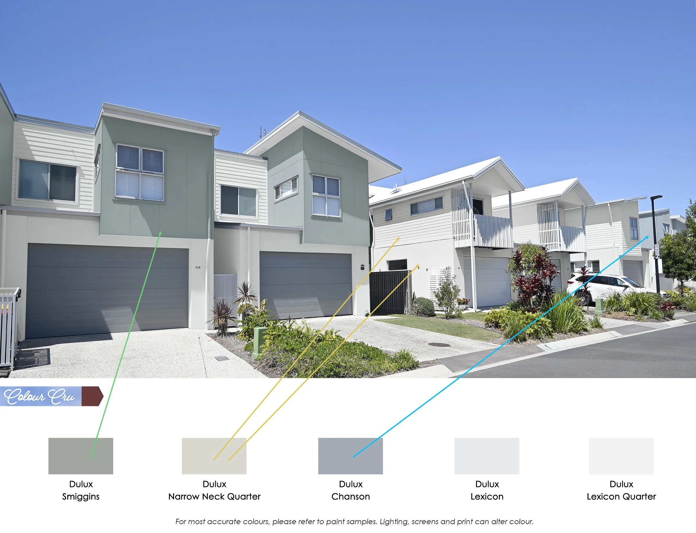
Being colourful doesn’t mean looking like the set of Play School. Colour can be fun without being outrageous.